![]()

A faded ol' well used map
Very early in my GIS career, about 1995, my coworkers and I made a big map (3ft by 6ft at 1:250,000). It took several months and was the best we could do at the time. It was good, but, in my mind, not as good as I wished. It was printed by a 4 colour 300dpi printer, the lines were fuzzy, colours dithered, fills crosshatched, and paper speckled. The base data was comprised of several tiles, and the edge-matching was mediocre, the seams visible.
A decade and some later finds me working in an organization with deeper pockets, access to a high quality 2880x1440dpi printer with UV resistant inks (11 colours), seamless edge-matched data, and shaded relief images. A person wanders into my office and unfurled this raggedy old map. I immediately recognized it as the one we did in 1995. The corners were dog eared, full of pin holes, numerous tears adorned the edges, and wrinkled throughout. The colours had faded, the once blue rivers now a faint pink. It had been traveling from meeting to meeting, wall to wall, discussion to discussion, for 13 years and looked it.
A modern map composition, not good enough.
She asked, hopefully yet resigned to a negative reply, if I could, perhaps, scan the map and print a new copy. (She had no idea I was one of the authors, her coming to our shop was just chance.) Excitedly I jumped at the chance to furnish her with a new map of the same area, made just the year before, but with much higher production value. Richer, deeper, more varied colours. Fine, crisp lines. Smooth typography, following the curve of watercourses, legible even at 6pts. No edge-matching seams. Shaded relief background smoothly blended with vegetated areas and ice fields. Finally I could fill that lack from long ago, with flourish!
She eyed the proffered replacement a time, and then politely declined. Yes it was beautiful, she said, but not as good as the old one. I was shocked. I’m sure my mouth hung open. You see, one thing we’d done all those years before, with equipment that had less computing power than today’s phones, was add place names. Lots and lots of place names, based on local knowledge. Oh. Our new maps don’t have those.
The end result? We don’t have a map-size scanner, so I carefully taped all the rips and tears on “old faithful”, double taped the edges, tripled the corners, and sent it and her back on their rounds. The old thing is probably still being used now.
A predecessor once told me, “It’s all about the data. All that other stuff is just fluff that comes and goes”. At the time he was referring to software, but this story makes it clear it applies to other technology like computers and printers as well. I didn’t really get it then, but I’m closer to understanding what he means now.
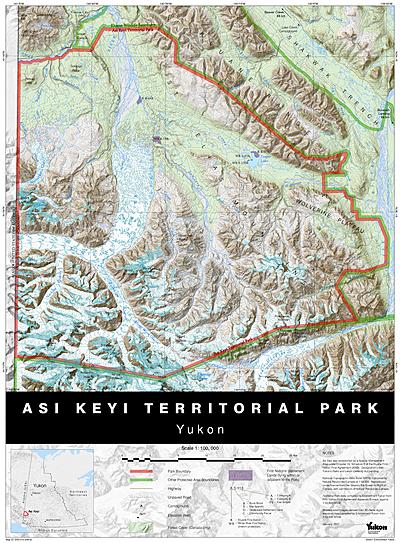
(The images are representative, they’re not the actual maps in the story. Hat tip to Bruce Mackenzie then of Ministry of Environment, Lands & Parks, BC.)
Filed under Blog Cartography
Tagged: cartography
You are an excellent writer.
Good point made as well. Cartography is just a tool to relay information, if it doesn’t do that, its worthless.
Really well-written article Matt